Personal project. Design and Animation.
What better occasion than 36 days of Type for pushing one of my favourite project a little further.
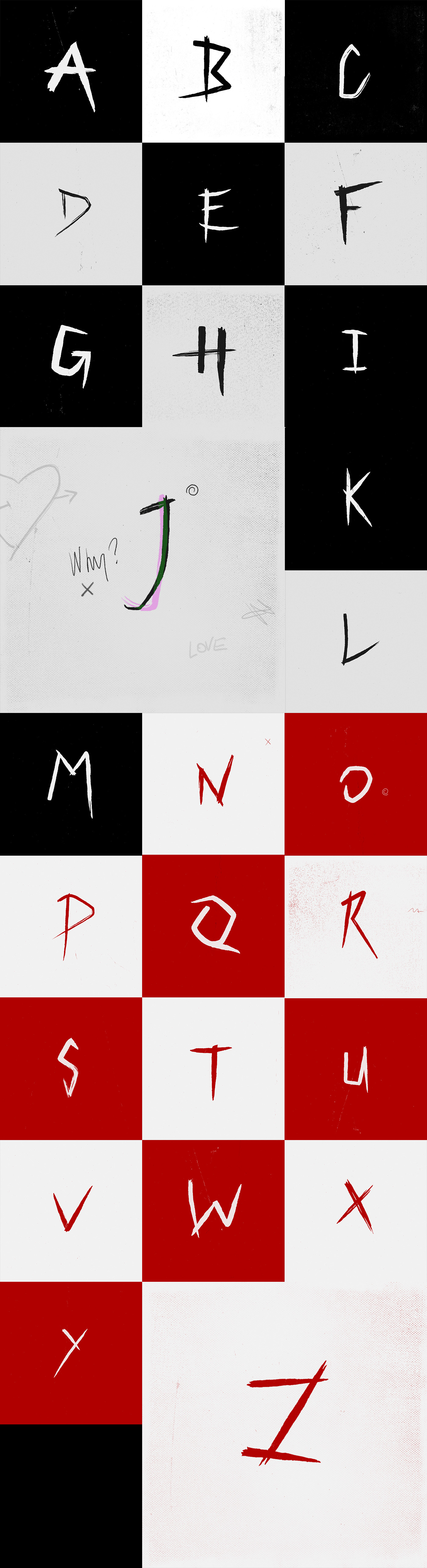
Based on the lettering I created for the title sequence of the British comedy/horror movie Tales from the Lodge,
I redesigned, rearranged and mostly cleaned every individual letters. Then I animated each letters and created animated names just for the love of it!
I really enjoyed working with letters, timing, textures and little bits of frame by frame animation! Everything was done in After Effects and Photoshop.
Like in every personal projects I've learnt a lot (re)making these letters and animating them. There's a few things I would have done differently though, looking back at it now.
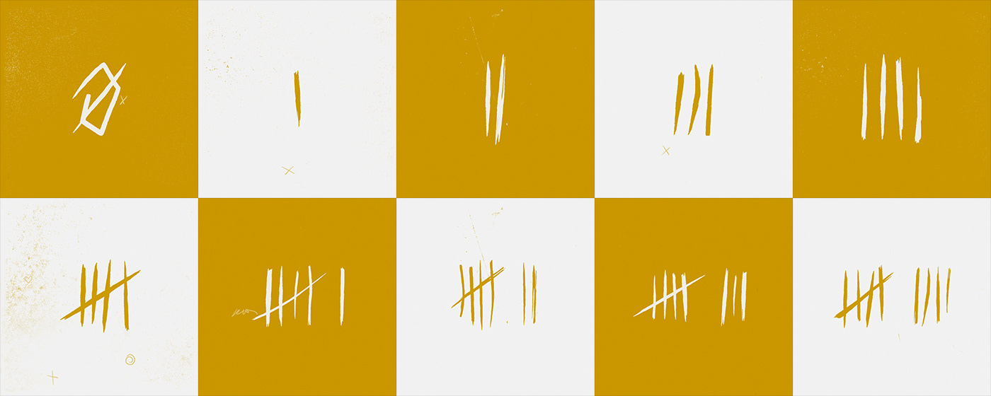
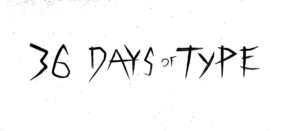
First the numbers; at the time I thought it would look cool to change the latin numbers with something more in line with the concept of wood carving, hence the strokes. But it makes it harder (not to say impossible) to use numbers in other context, proof is I drew the 36 just for this page!
The other thing would be the colour scheme (black/white, red, yellow). It works individually in each compositions but when all the letters are laid out together I don't like the red and yellow "blocks" that it creates. I should have rather mixed the colours more from the beginning in order to have a better homogeneous look, or simply kept only one accent colour with the white.
Keep scrolling down to see some of the animations! Or see them all on my instagram account.
Thanks for stopping by :)